Detect Dashboards
The Immuta Detect dashboards are the visual answers to the questions about who is accessing data. Additionally, with data classification enabled, you will have the visual answers of how much of your data and the data being accessed is sensitive. Immuta Detect offers several dashboards to help you find the information you need which can be filtered or set to a specific date range by the viewer.
Note that data classification to determine sensitivity is not supported with the Databricks Spark or Databricks Unity Catalog integrations.
Data-centric views
Activity summary of all data sources
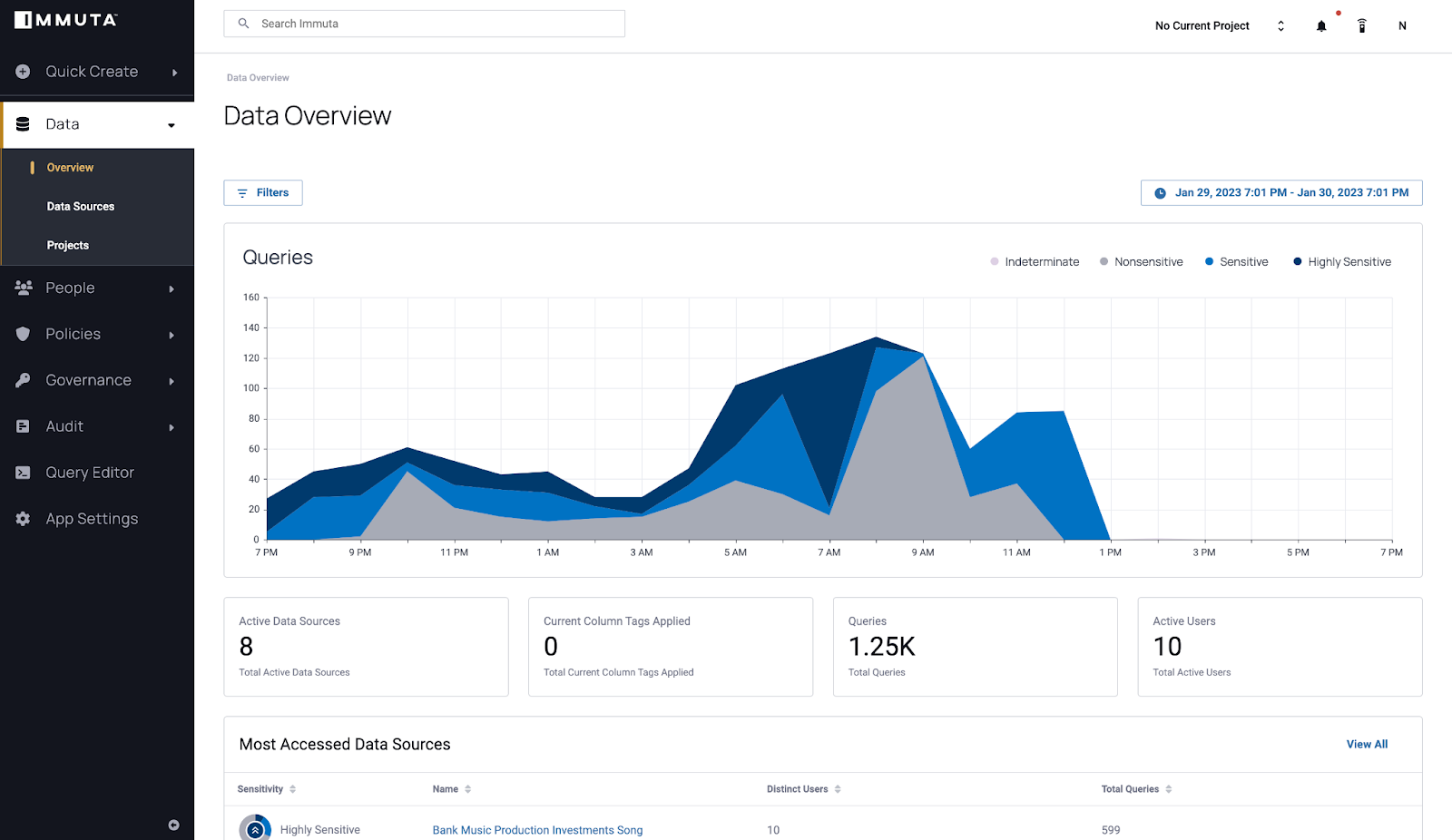
The overview dashboard is available in the data tab of the UI. It provides a quick overview of your global data environment that allows you to determine the number of queries and data sources at a glance and includes the following:
- A graph of the number of queries on all data sources for a set time
- The total active data sources in your environment
- The total tags that were applied to the columns of the data sources in your environment within the selected time frame
- The total number of queries for the set date range
- The total number of users who have made queries during the dashboard's specified date range
- A table of the most accessed data sources in your environment, the number of users who were accessing them, and the total queries on them
Additional functionality with classification
With classification enabled to determine the sensitivity, the dashboard will reflect the sensitivity of the queries and data:
- The graph will reflect not just the number of queries by the sensitivity of them as well.
- An activity indicator to visualize the sensitivity of the data within data source is added to the table of the most accessed data sources.
Activity summary by data source
Each data source has a dashboard available when you select the data source on the data tab of the UI. This dashboard allows you to quickly determine what data has been accessed in a single data source over time and includes the following:
- A graph of the number of queries on the data source for a set time
- The current active policies on the data source
- The number of column tags that were applied to the data dictionary within the selected time frame
- The total queries on the data source
- The total number of users who have made queries on the data source during the dashboard's specified date range
- A table of the most recent queries, the user making the queries, and the number of columns they saw in the query
Dashboards for Snowflake data sources will also include a table of the columns most actively queried.
Additional functionality with classification
With classification enabled to determine the sensitivity, the dashboard will reflect the sensitivity of the queries and columns:
- The graph will reflect not just the number of queries by the sensitivity of them as well.
- An activity indicator to visualize the sensitivity of the data within queries is added to the table of the most recent queries.
- An activity indicator to visualize the sensitivity of the data within columns is added to the table of the most actively queried columns.
Audit
Audit page
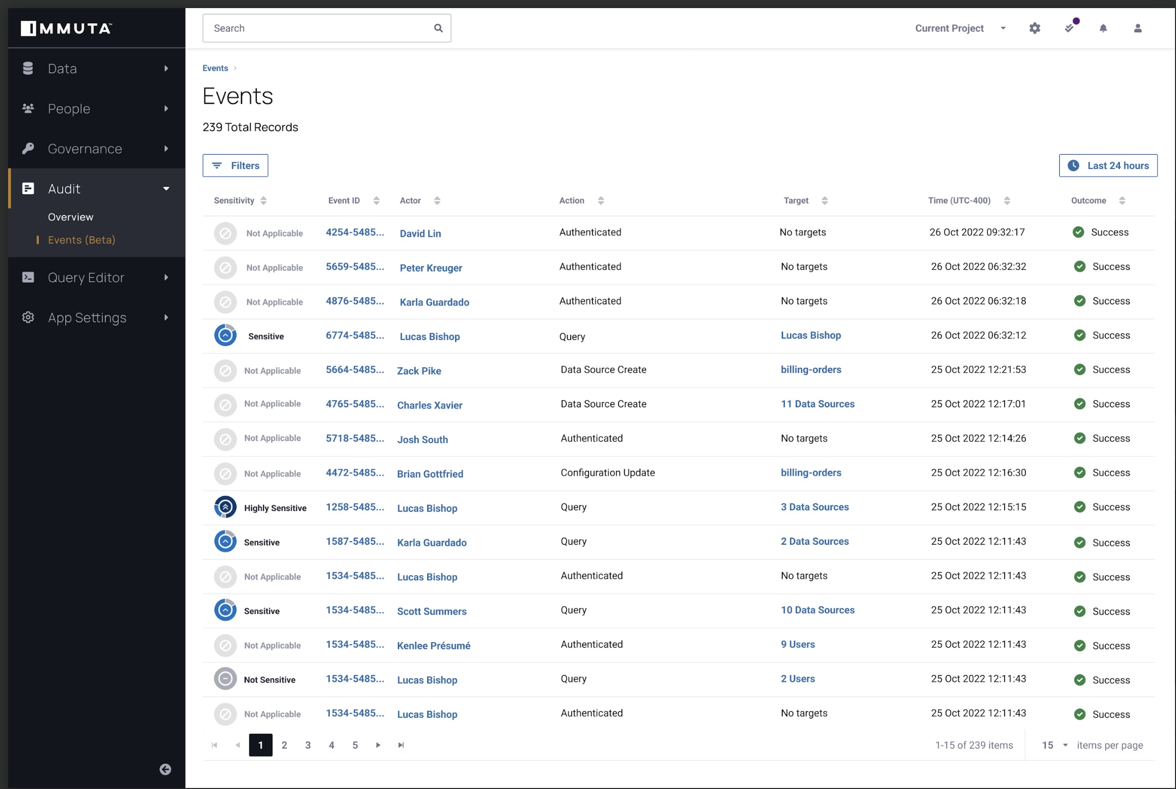
The audit dashboard is available in the audit tab of the UI. It provides a single table with all of the authentication and query audit events for your Immuta instance. Each row of the table represents a single audit event and includes the following:
- A link to the individual event dashboard through the Event Id
- The actor, which is the user who completed the event and a link to their activity summary
- The action, which is the event the audit record represents
- The target, which is the data source that was affected by the event
- The time the event happened
- The outcome of whether the event was successful or not
Additional functionality with classification
With classification enabled to determine the sensitivity, information about the sensitivity of the events will be added to the dashboard through an activity indicator that will visualize the sensitivity of the events.
Detailed audit by query
Query audits each have a dashboard when you select the event ID listed in the audit page. This dashboard allows you to quickly understand information about the data accessed by the query and includes the following:
- Details about the audit event
- Details about the actor or user who made the query including a link to their user page, their username, and the user
agent where they accessed data
- If the actor is not registered in Immuta and the actor is listed as "unknown," their data platform username is included.
- Details about the query itself: the data platform, the text, how long the query took, and when the query was made
- A data source tab with information on the data sources queried, the tags applied to the data sources, etc.
Dashboards for Snowflake query audits will also include a column tab with information on the data sources queried, the columns within the data sources, and the tags applied to the columns.
Additional functionality with classification
With classification enabled to determine the sensitivity, the dashboard will reflect the sensitivity of the query and data through a visualization of the sensitivity of the data found by the query.
Detailed audit by event
The following events are captured in UAM and will also show a detailed audit page with information about the event, the users involved, and the targets affected by the event:
- Attribute events
- Data source events
- License events
- Purpose events
- Tag events
- User management events
- Webhook events
User-centric views
Activity of all users
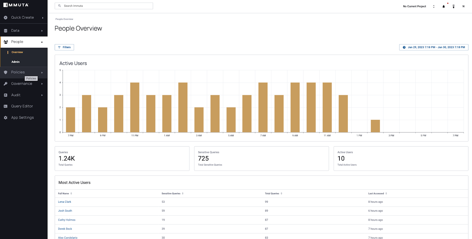
The people overview dashboard is available in the people tab of the UI. It allows you to view when users are most active in your data environment and easily see spikes or anomalies. This dashboard includes the following:
- A graph of how many users are active during specific times
- The total number of queries
- The total number of users who have made queries during the dashboard's specified date range
- A table of the most active users in your data environment with details about the number of queries they are running.
Additional functionality with classification
With classification enabled to determine the sensitivity, the dashboard will reflect the sensitivity of the queries:
- A count of the total number of sensitive queries
- The addition of the number of sensitive queries to the most active users table
Activity summary by user
Each user has a dashboard when you select the full name from the people overview dashboard. This dashboard allows you to quickly determine how frequently users are querying data and includes the following:
- A graph of the number of queries the user has made for a set time range
- The total number of queries that user has made in the time range
- The number of tables the user has queried
- A table of the most recent queries the user has made, which will have different content based on the integration type:
- For organizations using a Snowflake integration, the table will include a link to the audit event dashboards, a link to the data source dashboard, the number of rows and columns in each query, and a timestamp.
- For organizations using a Databricks Spark or Databricks Unity Catalog integration, the table will include a link to the audit event dashboards, a link to the data source dashboard, and a timestamp.
Additional functionality with classification
With classification enabled to determine the sensitivity, the dashboard will reflect the sensitivity of the queries:
- The graph will reflect not just the number of queries by the sensitivity of them as well.
- A count of the total number of sensitive queries is added to the dashboard.
- An activity indicator to visualize the sensitivity of the data within queries is added to the table of the most recent queries.